The Ocean slide look
Talks use the Ocean look by default: Ocean blue, light backgrounds and amber accents. An existing talk takes this look when you compile it. Your outline content is unchanged, and the Classic palette restores the earlier styling.
What changed in existing talks
When you compile a talk made earlier, its slides use the Ocean look. Their colours and the arrangement of some layouts can differ from what you saw before. Your outline content stays intact. New talks also use Ocean unless you choose another palette.
To get the earlier look back, choose the Classic palette, as described next.
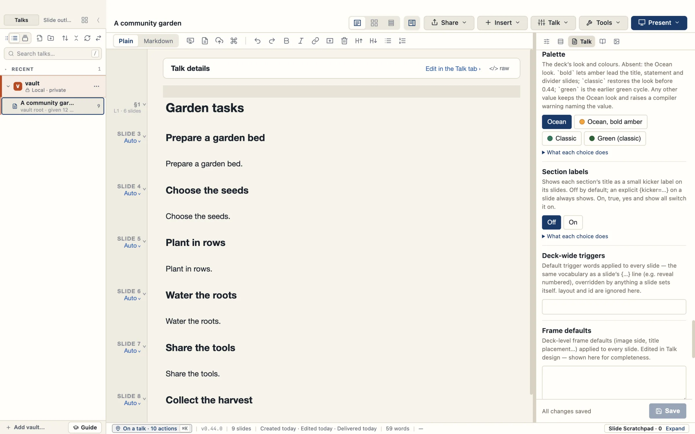
Choose a palette
- Open the Talk tab, then Design › Palette.
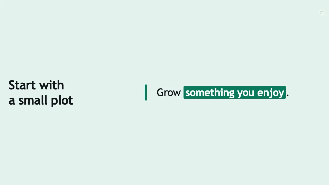
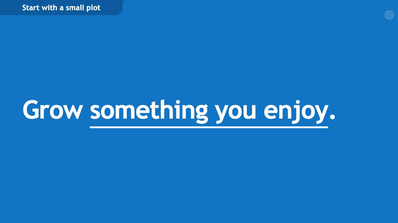
- Choose a palette. Ocean is the default blue look. Ocean, bold amber lets amber lead the title, statement and divider slides; detail slides stay blue. Classic is the earlier slide styling. Green (classic) is the earlier styling in its green colours.
- Compile the talk to see the chosen styling.
If you edit the outline directly, set the palette in the outline’s opening settings. palette: classic selects Classic and palette: bold selects Ocean, bold amber. palette: green selects Green (classic). With no palette value, the palette is Ocean. Any other value keeps Ocean, and the compile shows a warning.
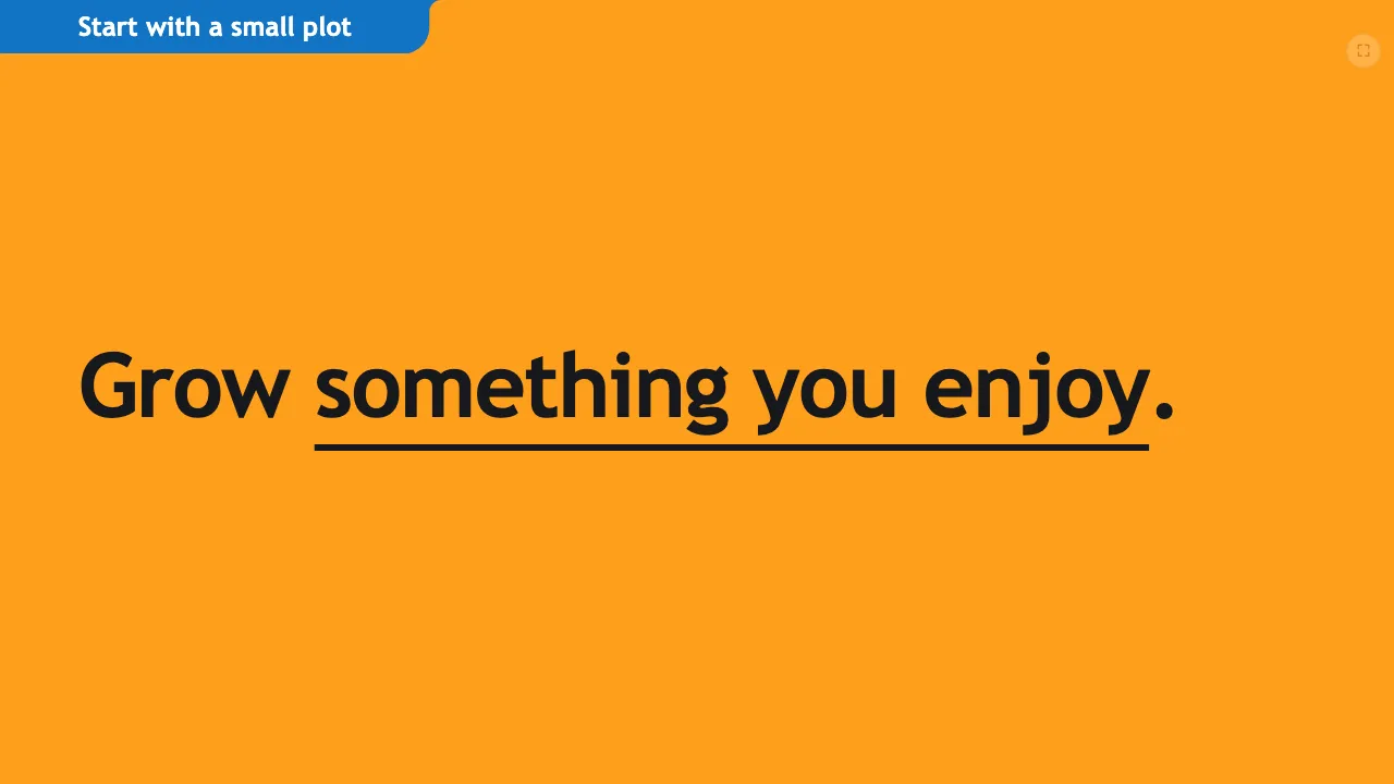
The same statement slide in three of the palettes:
Section colours
In the Ocean look, each section of a talk has a lead colour. By default the sections take five colours in turn: blue, amber, light, deep blue and light with amber, then blue again. Adding a slide inside a section changes no colour; adding a section moves the colours of the sections after it.
The lead colour goes to the section’s divider, its full-colour statements, the rule on its light statements, the side rail beside a slide title and the title tab. Slides before the first section, such as the title slide, take the first colour. Detail slides keep their blue colours by count, the current item in a reveal stays blue, and the current stop on a loop stays amber.


Choose the colours for the whole talk
- Open the Talk tab, then Design › Section colours.
- Choose Rotate for the five colours in turn, Off for one colour throughout, or one colour for every section: Blue, Amber, Deep blue, Light or Light with amber.
- To rotate through your own colours, type them in order under Or rotate through your own list, in order, for example
blue, light.
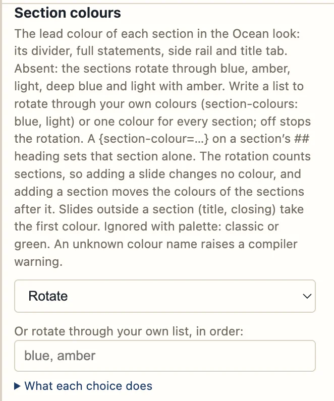
If you edit the outline directly, use section-colours: in the outline’s opening settings:
| Setting | Result |
|---|---|
No section-colours: line | The sections rotate through blue, amber, light, deep blue and light with amber. |
section-colours: off | No rotation: every section is blue (amber with palette: bold). |
section-colours: amber | Every section takes that one colour. |
section-colours: blue, light | The sections rotate through the colours in the list. |
The colour names are blue, amber, deep-blue, light and light-amber. A name that is not one of these is reported when the talk compiles.
Give one section its own colour
Write {section-colour=…} on the line under the section’s ## heading:
## What could go wrong
{section-colour=light-amber}
The other sections keep the colours the rotation gives them.
Other palettes and Pathways
Classic and Green (classic) have no section colours. With Ocean, bold amber and no section-colours: line, every section is amber; a list or a section’s own colour still applies. A Pathway shows each section in the colour it has in the full talk.
Colour follows the number of items
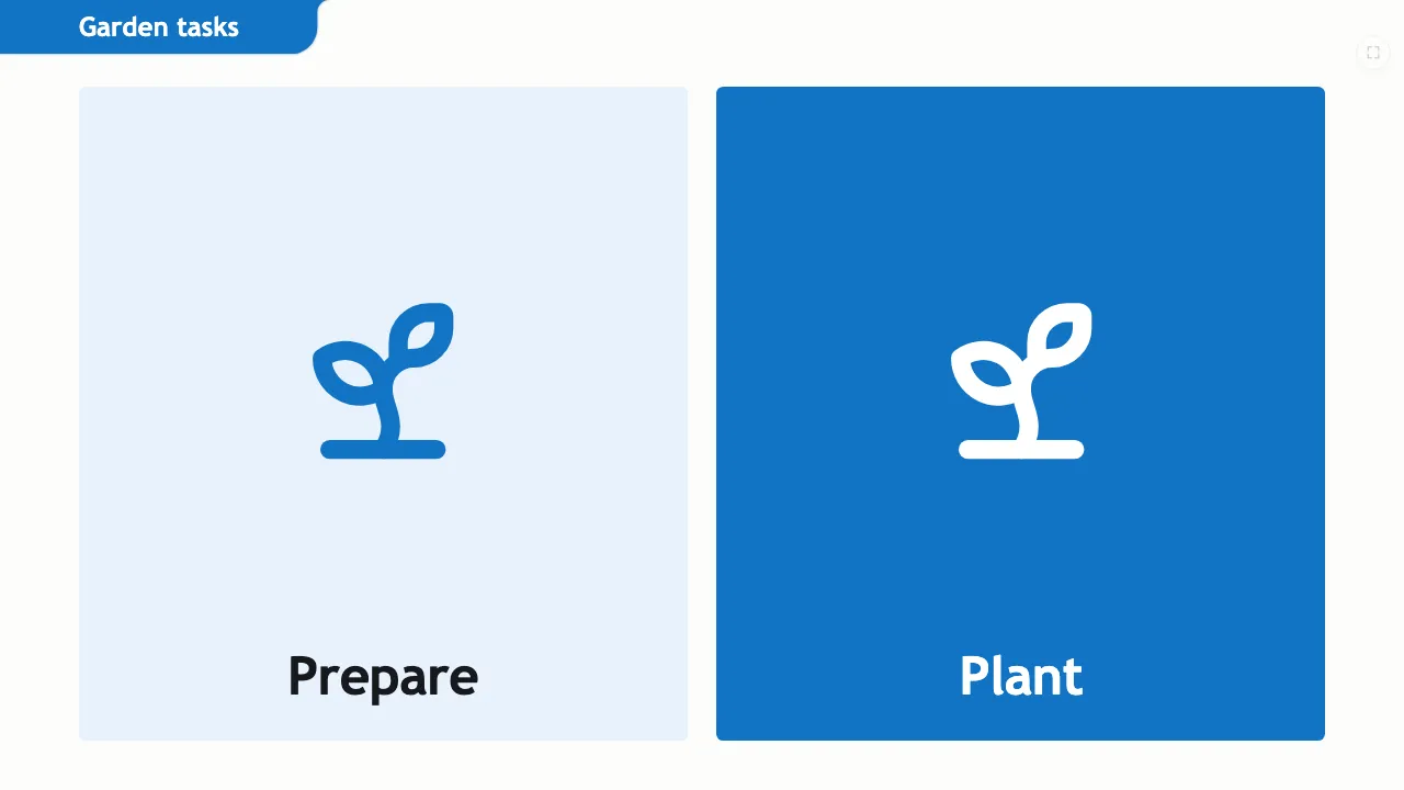
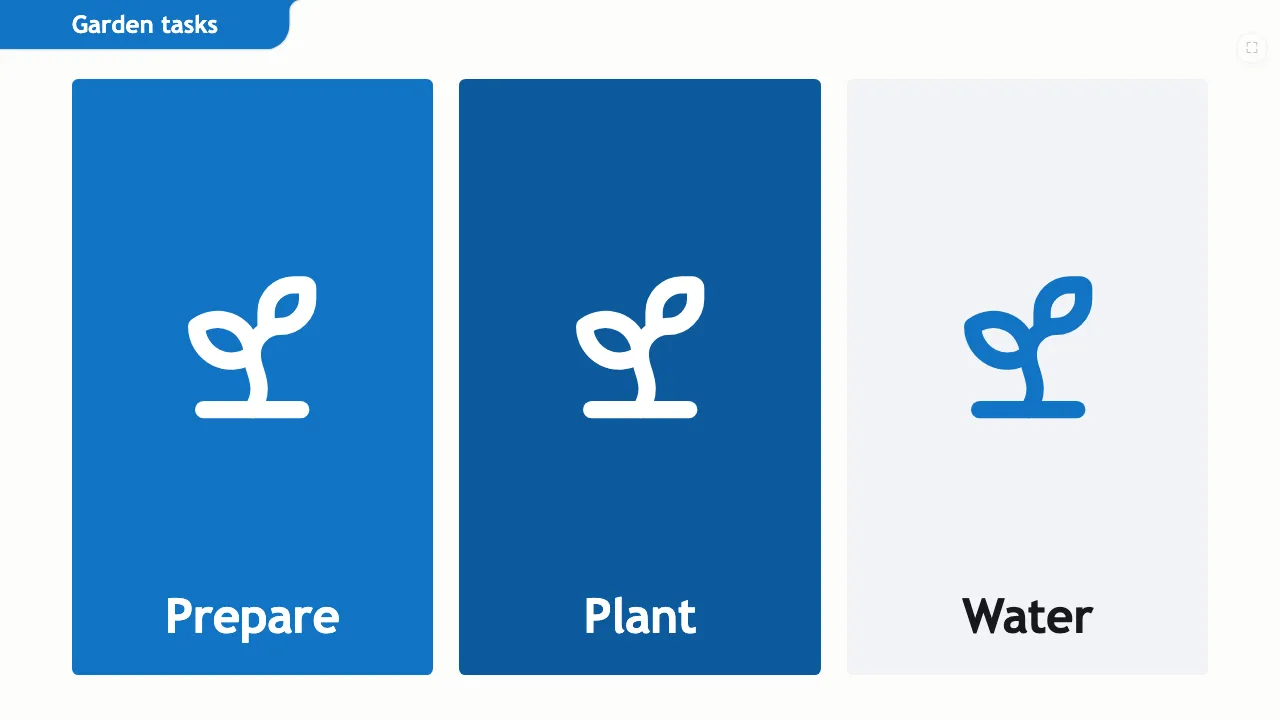
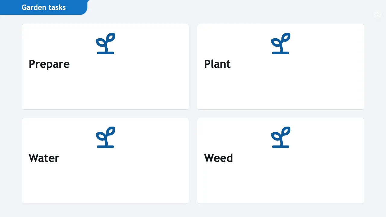
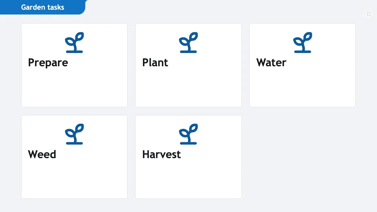
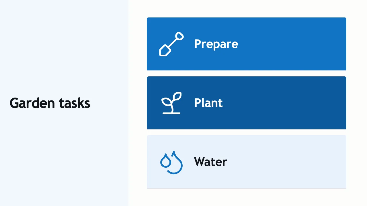
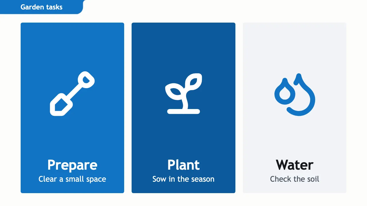
The colours and arrangement of a layout depend on how many items it contains. With two items, icon panels use a light panel and an Ocean panel. With three, they use Ocean, Deeper Ocean (a darker shade of the Ocean blue) and a light panel. With four, they use white panels with blue icons. Five items use a more compact arrangement. Pie charts also change by count: two slices use Ocean and light, three add Deeper Ocean, and larger counts use strengths of Ocean.
Reveals and amber accents
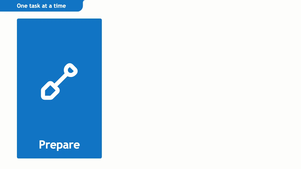
In a reveal, the current item on an icon list, icon row or tile slide has a solid blue fill with white text and icon. On a plain list, the current item has no fill: its words are at full strength and its dot is larger and blue.
Amber marks highlighted bars and pie slices, and the current stop on a loop. Key words on light slides are blue. With the Ocean, bold amber palette, those key words are also underlined in amber, and amber leads the title, statement and divider slides.
When a slide does not fit
TalkWeaver tries the Ocean sizes and arrangement first. If they do not fit a slide, it falls back to the earlier arrangement in the new colours, but only when that arrangement shows the text better. It does not cut a title short to keep the new arrangement. Dense lists can also keep the earlier structure. Words in boxes, such as icon rows, icon lists and cards, stay whole. If a word is too wide for its box, the label first takes a smaller size; if it still does not fit, the slide falls back. A word that cannot fit even then, such as a long web address, breaks inside its own box. On a loop, each stop’s label sits outside the ring and grows away from it, and a loop with long labels uses a smaller ring. A slide is fitted again when a picture or font finishes loading. A slide that still does not fit is flagged: the outline editor shows a ⚠ note on the slide’s line, and the compile lists a warning that the text is too long. Check your compiled slides after changing a palette.
Layouts drawn in Ocean
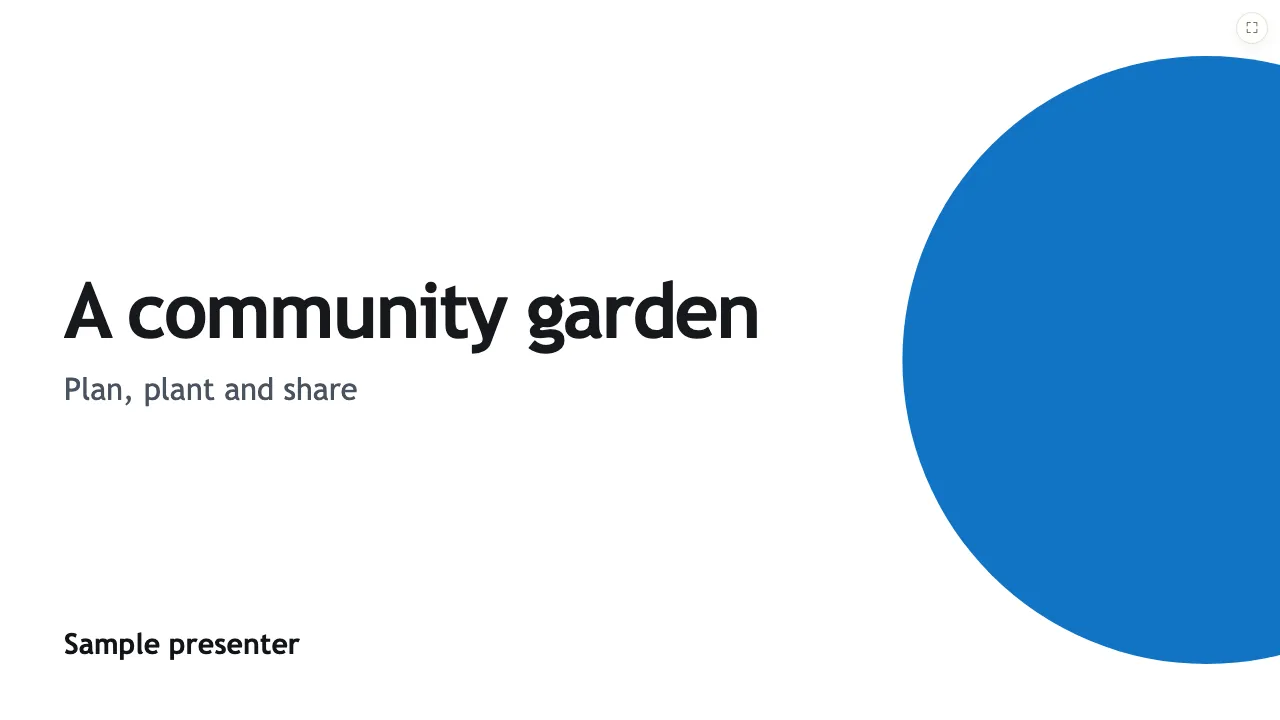
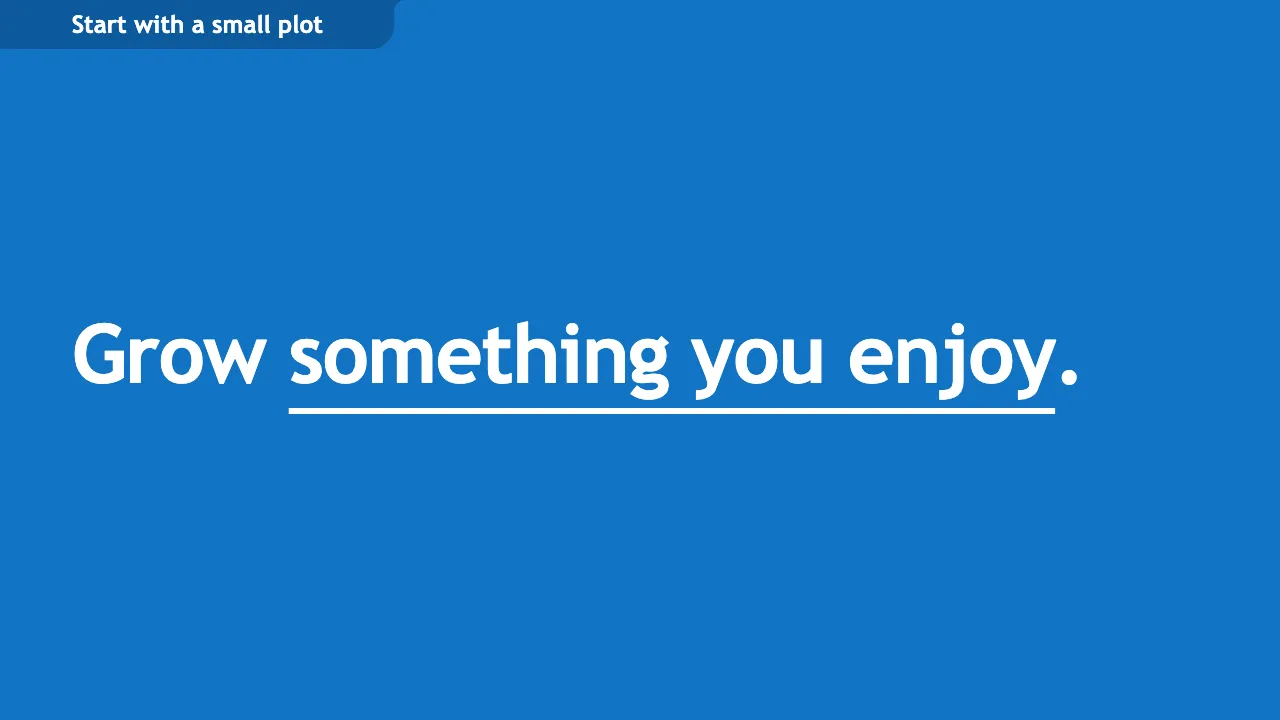
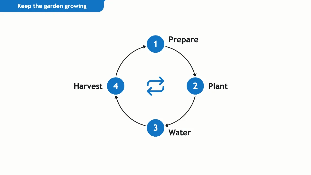
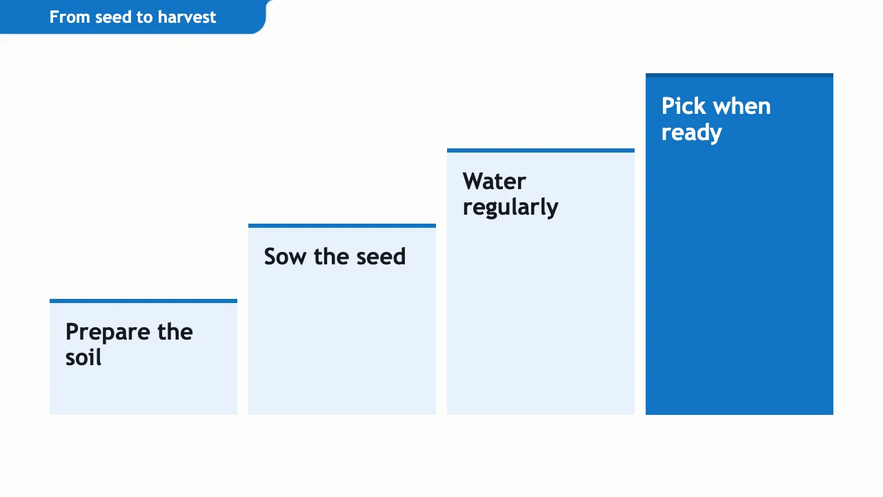
Statements and section dividers can use a full-colour background. Icon lists, icon rows and panels use larger icons and arrangements that depend on the item count. Plain lists spread points down the slide. Contrast and compare divide the slide into light and blue areas. Stats, bar and pie charts, loops, steps and the opening title slide have their own Ocean styling. The gallery below shows compiled slides.

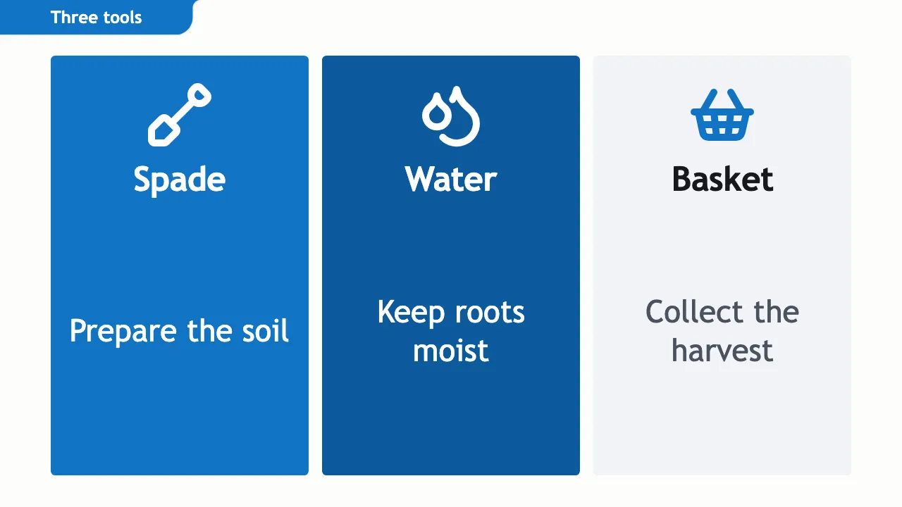
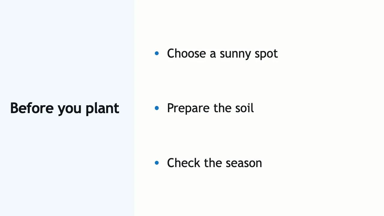
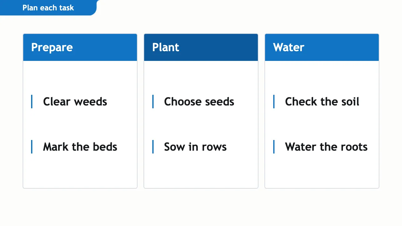
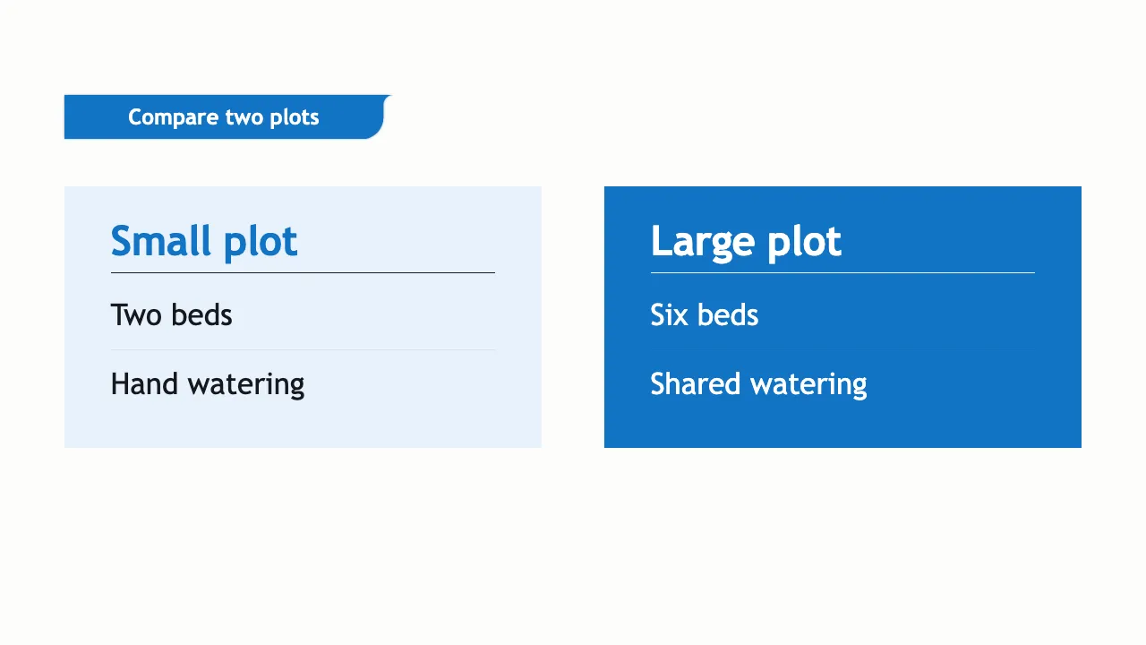
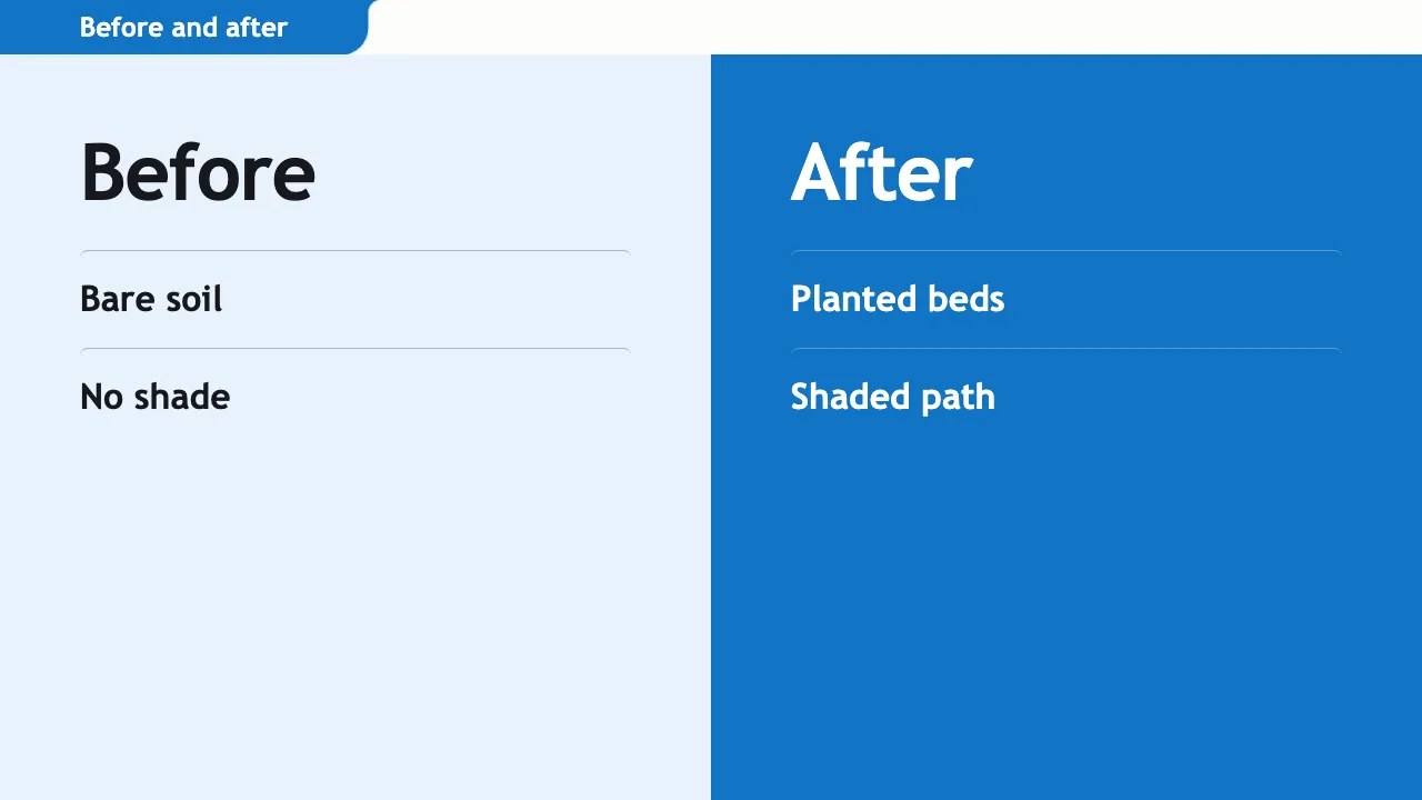
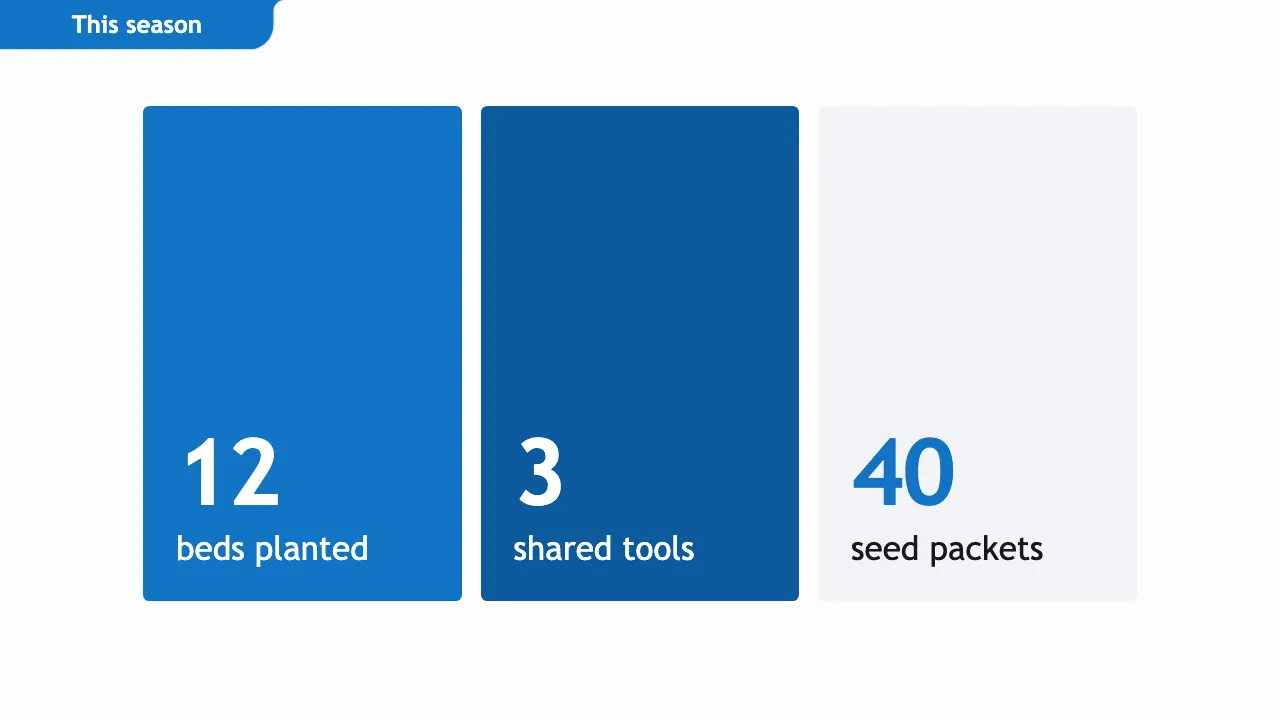
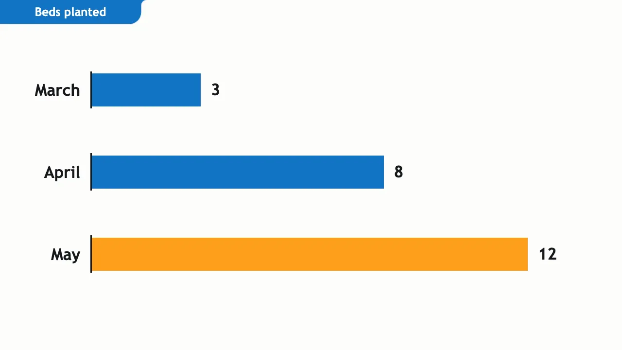
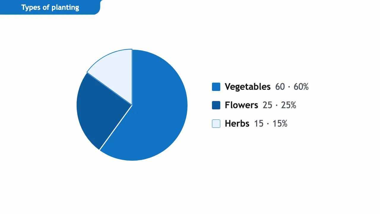
Seven repaired layouts
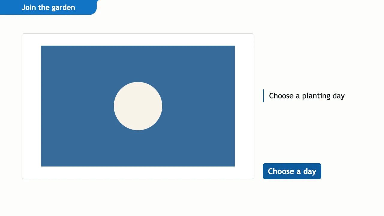
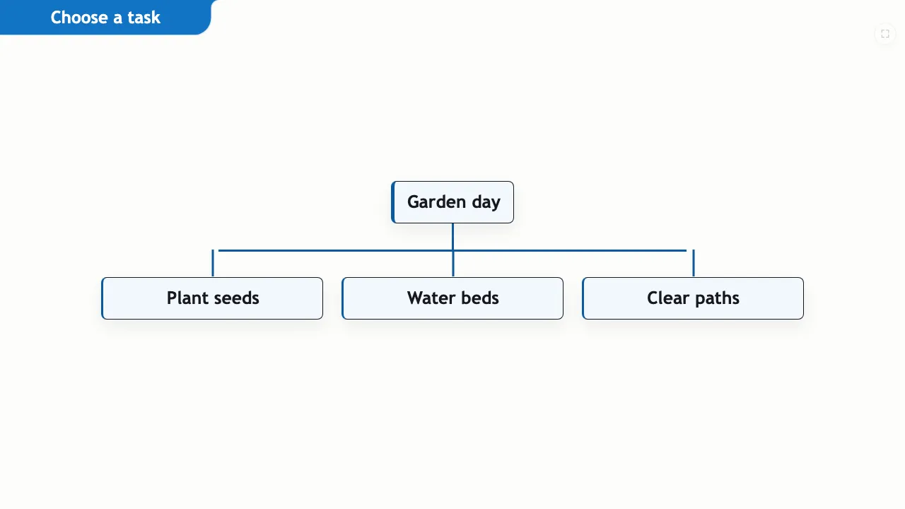
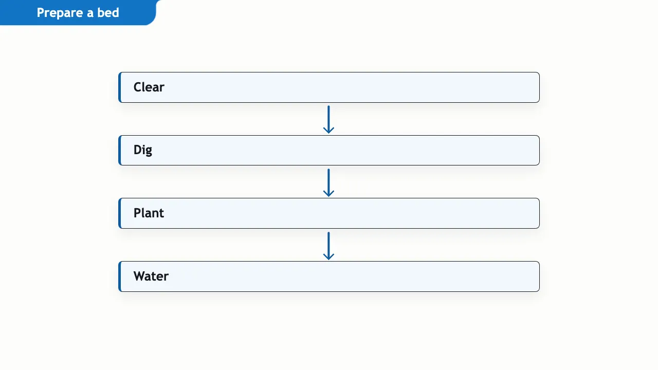
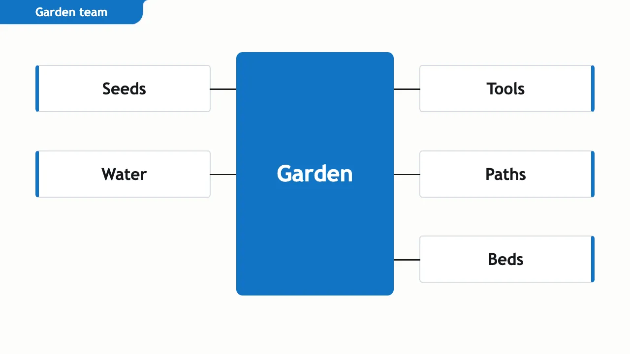
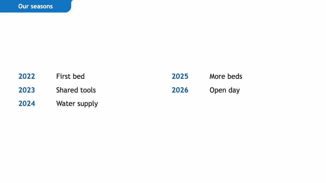
Seven layouts had faults that are now repaired. The table gives each earlier problem and what the layout does now.
| Layout | Earlier problem | Now |
|---|---|---|
| Screenshot slide with an action | Displayed raw action text. | Shows an action button. |
| Branching flow | Displayed a row without branches or connectors. | Draws the first item branching to the others. |
| Vertical flow | Arrows overlapped cramped box labels. | Places arrows between boxes, clear of labels. |
| System map | Omitted the surrounding parts and connectors. | Shows the centre, parts and connectors. |
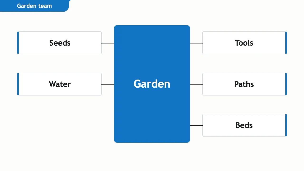
| Multicolour system map | Also omitted the surrounding parts. | Shows the centre and parts; Ocean uses one colour. |
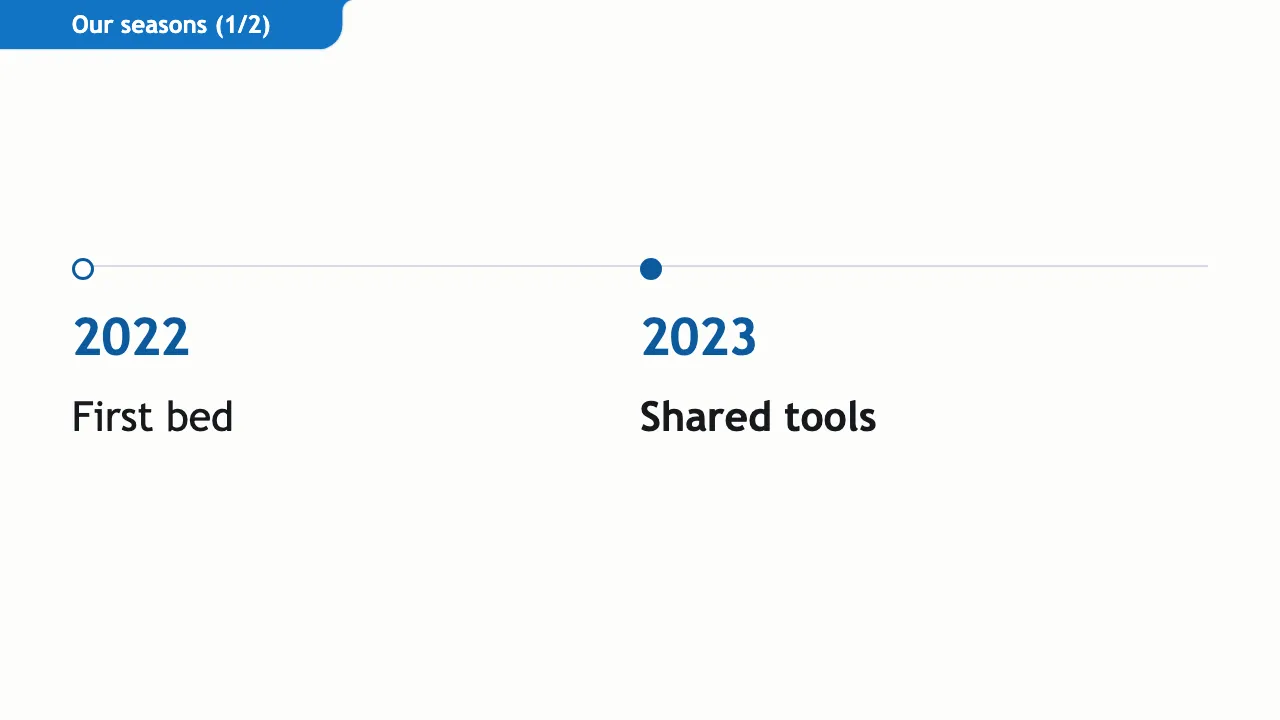
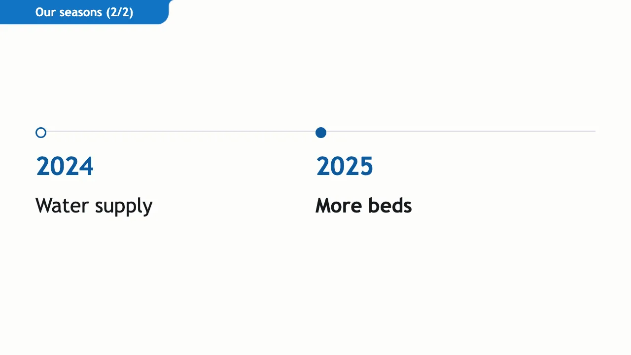
| Compact timeline | Dates appeared out of order across columns. | Reads chronologically down the first column then the second. |
| Split horizontal timeline | The second part was absent from the presented deck. | Presents both parts of the timeline. |
Known limits
Several diagram layouts keep their earlier structure in the Ocean colours, so not every layout has a new arrangement. On step slides with a lot of text, the text can run below the shorter steps. Classic remains available for talks you want to keep in the earlier style.